The new block editor uses an entirely different workflow than previous versions of WordPress, and once you get used to the way it works, you can quickly and easily create compelling content. Instead of one little editing window, you have a blank canvas where you can add text, images, lists, photo galleries, and much more. It works in many ways like a word processor for the web.
Blocks
Every time you tap the Enter (Return) key, you are beginning a new block. Each block has its own settings, and can easily be converted to another type of block by changing the block type. While you are typing, the editor is distraction-free, allowing you to concentrate on your content. By moving the mouse slightly, the toolbar pops up:
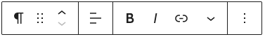
The icon at the left of the contextual menu shows the current block type, and in the above image, shows the Paragraph symbol. Next to that are the Move icons (see below). Next in from left is the text alignment tool, then the Bold and Italic tools. Next is the link tool. The drop-down arrow will have contextual options based on the type of block. For a paragraph, it includes things like Strikethrough, Superscript and Subscript, inline code and images, and text color. We have programmed in the official UNC color library, and ask that you use restraint with color and follow the university branding guidelines. The default font size and color have been carefully chosen with branding, professionalism, and accessibility in mind. See our article Headings and Hierarchy for more detailed information about best practices for structuring your page.
Block Types
Many types of blocks are available by default, and we have added an additional plugin to fill in some gaps. Please see our Block Reference page for examples used on our sites. This list is a starting point, and links open in new tabs to their definitions on the WordPress Block Support site:
Block Settings
When a block is selected, the sidebar on the right of your screen shows some more options. Block settings are contextual and will be different depending on the block type that you have selected. We encourage you to follow the links above to learn the specifics of how to work with the different block types, however we have written specific guides for the most common block types that you will be working with.
Moving and Removing Blocks
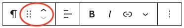
There are some hidden options for working with blocks that are important to know. Moving a block can be done by drag and drop by grabbing the icon made up of 6 dots (in the contextual menu), or clicking the up/down arrows to move the block up and down the page:
To remove a block, you may use one of several techniques:
- Use a key command (Control-Alt-Z on Windows or Control-Option-Z on Mac)
- Click the 3 dots at the right of the contextual menu to reveal the remove [block type] option
- Place your cursor after the block and use the backspace key (this option is the least reliable as it depends on the particular placement of your cursor relative to the block you want to remove)
The options 3-dot contextual menu will change depending on the block type, but there are some useful things to note:
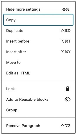
- Blocks can be copied, duplicated, moved, or locked
- New blocks can be inserted before or after the current block
- Blocks can be grouped together (on Student Affairs websites, this creates a padded, light gray background around grouped blocks)
- Although the options are there, we don’t recommend editing a block as HTML or using the “Add to Reusable blocks” option.
You can now begin to see how powerful and flexible the block editor is. It is heavily contextual, options for modification only being available when blocks are selected. Other concepts are covered in detail on this site to help you get the most out of the block editor on Student Affairs websites.